Have iMovie ’11 look like Final Cut
579 words, 3 minutes
For a while now, I used various video editing software to render personnal videos. I started with Pinnacle v8 a few years ago and switched to iMovie ‘09 when I got my MacBook Pro. I never got used to that GUI. This is why I switched to Final Cut Express quite fast and kept using it for a while. Now that I’ve upgraded the MBP to Lion, I was expecting better graphics acceleration with newer software version. The thing is, Final Cut Pro X is quite expensive. So I bought iMovie ‘11 and wanted it to look like software I was used to using. Here’re a few steps to walk to have iMovie look like Final Cut.
Default look
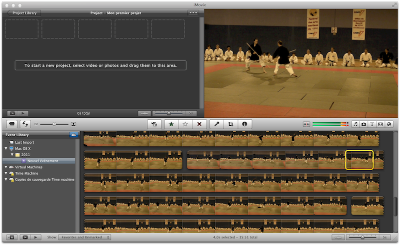
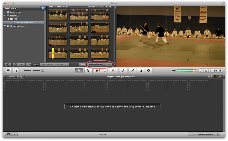
First of all, let’s have a look at the default iMovie ‘11 layout.
There are several things that I don’t like much:
- the project layout is stuck into a small 50% square zone ;
- the timeline scroll is set vertical rather than horizontal ;
- the video sequences are shown with long display. Really annoying when you have to deal with more than 5 rushes ;
- no viewing of the audio data.
Have a bigger timeline section
To have the project section, or timeline, appear in a bigger zone, in the
“Window” menu, select the “Swap Events and Projects”. You can also use the
“Swap Events and Projects” button that lies on the left side of the middle
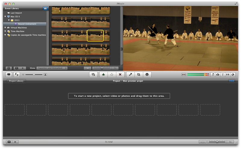
command bar. Once done, you’ll get:
First step to a better timeline zone.
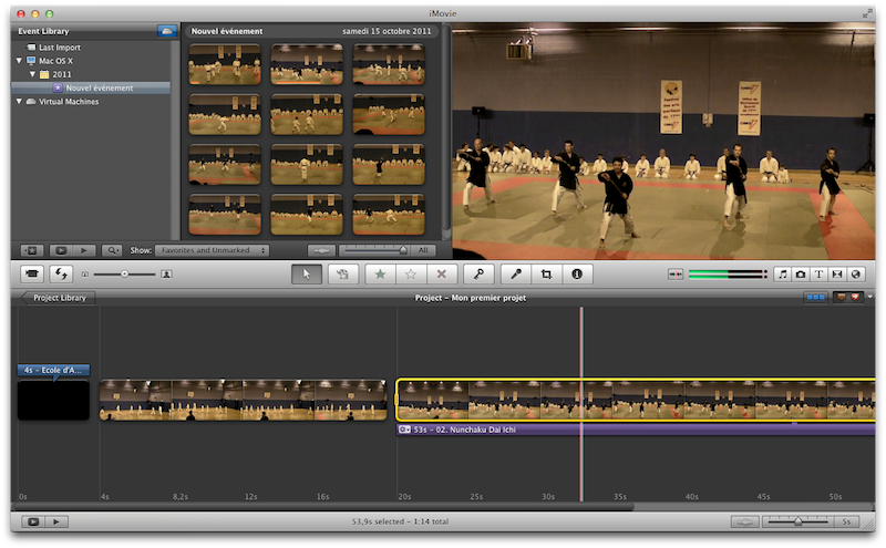
Set an horizontal timeline scrolling
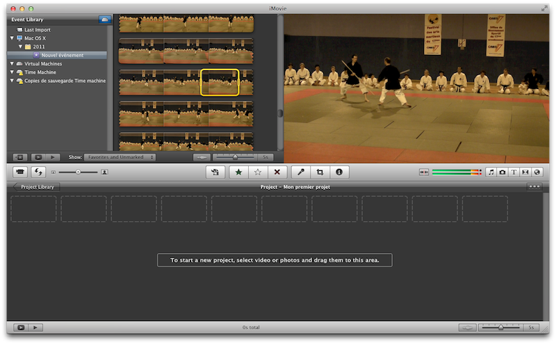
Second step is to get an horizontal timeline scrolling rather than the default vertical one. I couldn’t find the menu action for it so just click the “three grey squares” button on the right side of the middle command bar. It will turn that button into a “three blue squares” button and setup a continuous timeline.
You won’t see much in my screenshot as I didn’t drop any video in the timeline. But you’ll see the difference when you’ll do so.
Show advanced tools
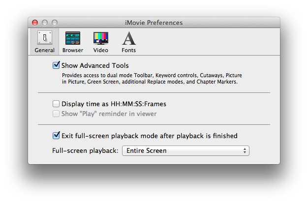
Next thing I did is enabled some advanced tools. In the “iMovie” menu, select
the “Preferences” option. In the “General” section, check the “Show Advanced
Tools”:
You will then have access to whole set of advanced tools.
Shortened clip thumbnails
I think what I hate the most about iMovie are the clips thumbnails. By default, a clip is subdivided into 5 seconds parts. This mean when you have 3 clips of 1 minutes each, you get a whole lot of video thumbnails rather than just 3. Once again, I didn’t found the menu setting for it but you can just use the slidebar that seats beneath the clips window. Slide it until it is set to “All”.
Hurrah! Now you get a single thumbnail per video clip.
Show audio tracks
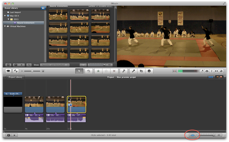
Should you want to deal with the audio tracks of the video you selected, you can have it shown under every clips. For each clips in your timeline, right click a clip and select “Detach audio”.
Use the oscilloscope button, at the bottom of the timeline bar to get bigger audio tracks. That will enable easy volume modification. As I did from the clip tumbnails, you can shorten the timeline thumbs so that you only get a single thumbnail per video clip.
Final Look Express
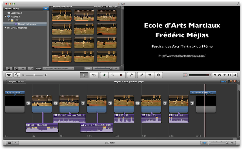
After those few steps, here’s what iMovie ‘11 looks like:
This is a layout that really fits my needs and way of working.
Happy Rendering Folks!
